A few years ago I took a class at our local college in typography and printing. We never actually printed anything (though we did learn how to spec print jobs, and we toured a couple of printing facilities), but we certainly messed around with type and graphic design. A lot. It was very fun.
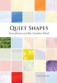
One assignment was to come up with three markedly different covers for the book title Quiet Shapes: Synesthesia and the Creative Mind. Here are my three. Which one do you like best?
And here's a typography exercise—also fun. (It is not actually Baskerville; that font was not available in AI. A "suitable" font was substituted.) Yes, I am a total type geek.
And to close, because of course there are lists of the best book covers of 2016, here are three (with surprisingly little overlap), courtesy of:
the New York Times
Paste magazine
BuzzFeed


No comments:
Post a Comment