Turns out, Mentalfloss has a whole feature called "The Afternoon Map," "a semi-regular feature in which we post maps and infographics. In the afternoon. Semi-regularly." Mostly silly—if not because of the content (as here: though the mapmakers obviously had fun with this, so there's that), then because you can't really generalize anything to an entire state. Or county. Or city. Or sometimes even household.
I spent two years studying cartography at the University of Wisconsin–Madison, just as the field was starting to tip away from handmade, beautifully researched and designed maps into digitized, GIS'ed representations of databased information. I had the good fortune to have Arthur H. Robinson as one of my teachers (indeed, he's why I chose the UW), author of The Look of Maps, The Nature of Maps, and the textbook Elements of Cartography, last printed in 1995. He also designed the compromise Robinson world map projection, which the National Geographic used for ten years before adopting the similar-but-different Winkel tripel projection.
At the UW we learned about choropleth maps, isoline maps, dot maps (dot density and graduated circles), flow maps, etc. (There's a nice resource online that describes all these here.) We learned about data selection, generalization, simplification, symbolization. We designed maps and fabricated them using now-antiquated means involving rubylith and knives and ink and paste-down lettering.
I learned there that maps lie: often deliberately, to ensure copyrights. But also because the mapmakers are only experts so far as their understanding of the data goes. You've heard the phrase, "Lies, damn lies, and statistics"? Well, those damn lies and statistics can be transposed into map form easily enough, and somehow they then become more believable. The typical map based on U.S. counties (a "choropleth" map) is one example. It's too complicated to go into here, but if you're interested, this is a really good discussion of the dirty-lying ways of poorly thought out (or connivingly manipulative) maps. In this country, people are barely taught to think critically about the information that comes rushing at them from all sides. But maps? Maps seem to be considered above reproach. Which is wrong. They need to be judged just as carefully as any information we are subjected to.
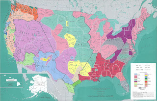
There are exceptions to the lying map, and those exceptions are probably my favorites: maps showing the physical world—soils, climates, geology, ecotones—or historical events and changes. They don't hew to political boundaries; they are organic, following natural features. Here are just a very few examples.
 |
| Native American lands pre-contact |
 |
| Soil moisture regimes |
 |
| Dominant soil orders |
 |
| Soil quality degradation indicator for cropland |
 |
| Geologic map (no key, which makes it basically a pretty picture) |
The list—or rather, the array of fascinating maps—goes on and on. Pretty much anything that has a spatial component that you might want to know more about? I'm willing to bet, there's a map for that.


No comments:
Post a Comment